


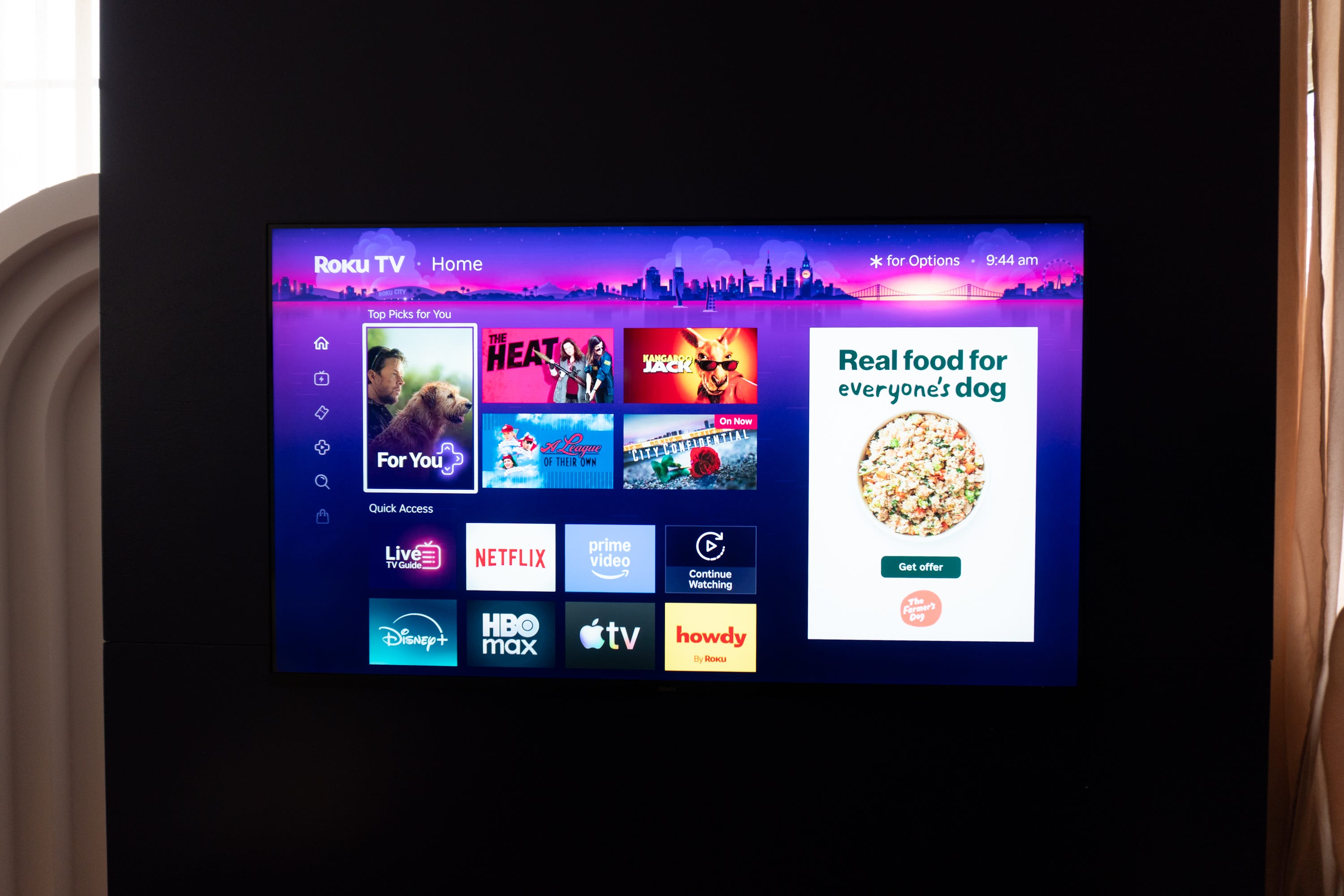

📺 Roku has announced a completely new UI for its TV home screen
🧠 The new interface is smarter with better personalization for each user
🎬 It’s quicker than ever to jump to your favorite apps, watch new shows and movies, and more
✅ All currently supported Roku devices will get the new UI
📆 Roku says the new home screen is rolling out to U.S. users starting today
Roku hasn’t updated its smart TV interface in a while, but that’s changing today.
We had boots on the ground at Roku’s big event in New York City, where the company has taken the wraps off its new user interface, which integrates a smarter, more personalized experience for each individual user. It’s the biggest upgrade that Roku has introduced since 2017, bringing it more in line with platforms like Google TV and Samsung’s Tizen OS.


The new Roku Home Screen is more content-focused and wants to get out of the way as quickly as possible, all while maintaining Roku’s signature design language. Roku did a lot of research on where your eyes land when looking at your TV, what your needs are when you power it on, and how quickly you want to get away from the Home Screen and start watching your favorite show.
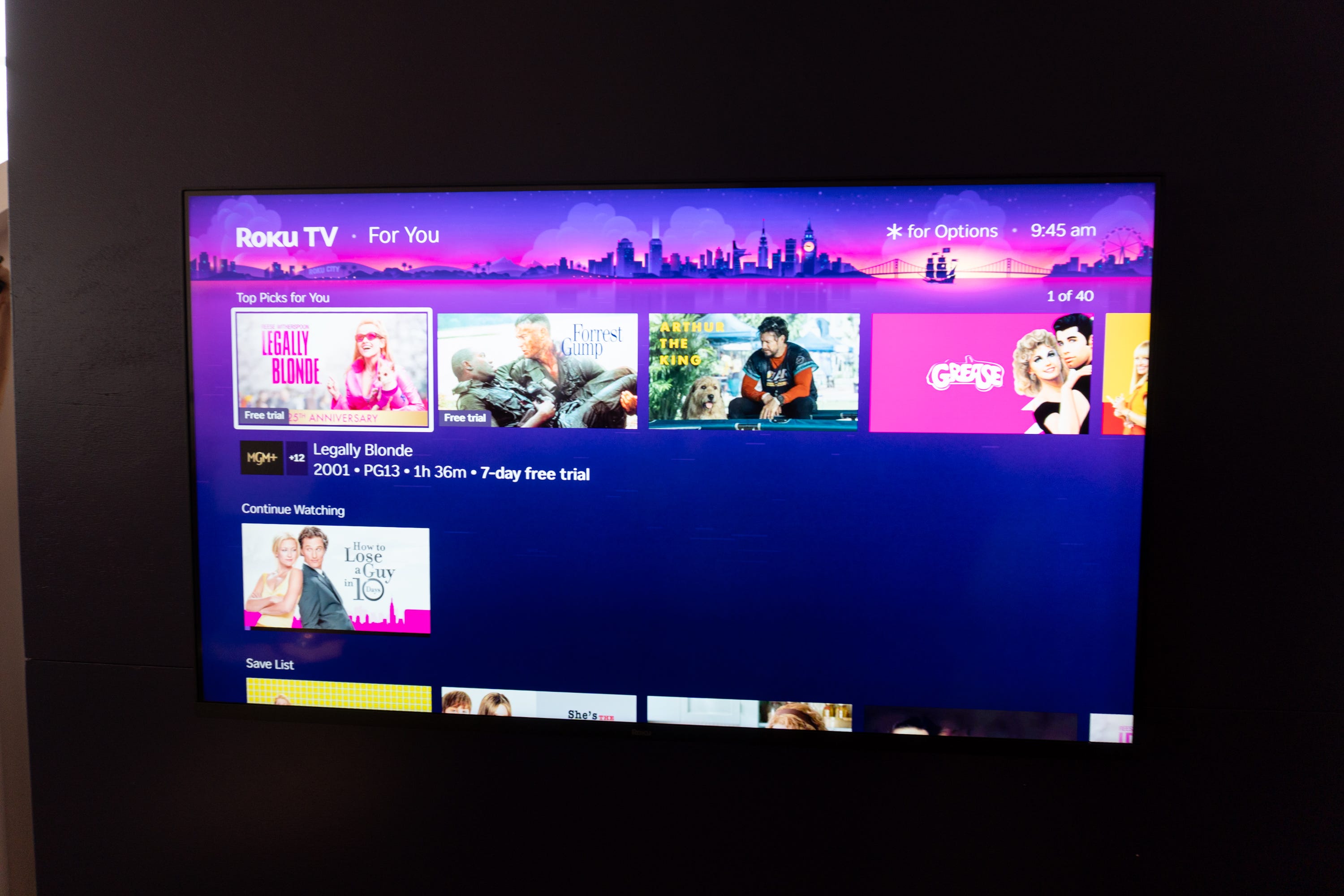
This influenced the design of the new UI, which should help you get to your apps quicker than ever before. There’s Quick Access, which can dynamically recommend apps based on the time of day. There’s also a new section called “Top Picks for You,” which highlights content you’re likely to enjoy next right at the top of the screen.
There are also new genre-focused sections on the Home Screen for recommending content. “For You” will sift through movies and TV shows in specific genres and present the titles Roku thinks you’ll like, while “Subscriptions” will highlight new content from all of your connected subscriptions.
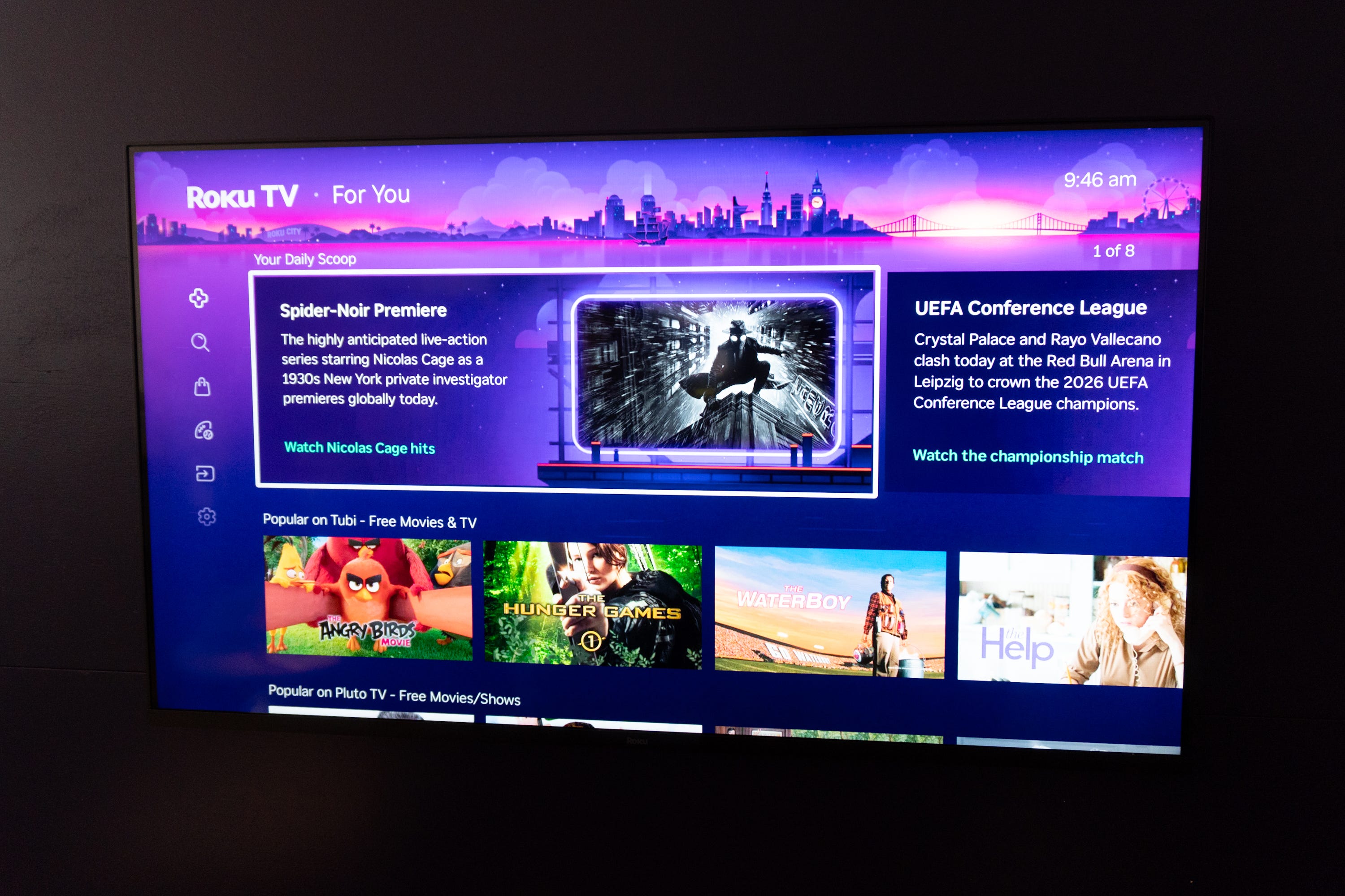
The menu that usually sits on the left now dynamically retracts, only expanding when you move your cursor over to the left to jump between sections. This allows for more content and app shortcuts in the middle of the screen.
Search has also gotten an upgrade with more personalized suggestions and better context. There are also bigger, more prominent shortcuts to things like your watch list and history. A new section called Your Daily Scoop, which basically tells you what’s culturally trending in the world of streaming.
Roku says that the new UI is still fast and snappy, and it’s optimized for everyone with the latest Roku devices to those still holding onto streaming sticks from 10 years ago. There’s also a fun Easter egg in the new Roku City Tile, which gives you quick access to signature Roku mini games in the company’s hyper-futuristic city landscape.
The new Roku Home Screen is rolling out starting today to users in the United States.
Max Buondonno is an editor at The Shortcut and co-host of The Shortcut Live. He’s been reporting on the latest consumer technology since 2015, with his work featured on CNN Underscored, ZDNET, How-To Geek, XDA, TheStreet, and more. Follow him on X @LegendaryScoop and Instagram @LegendaryScoop.